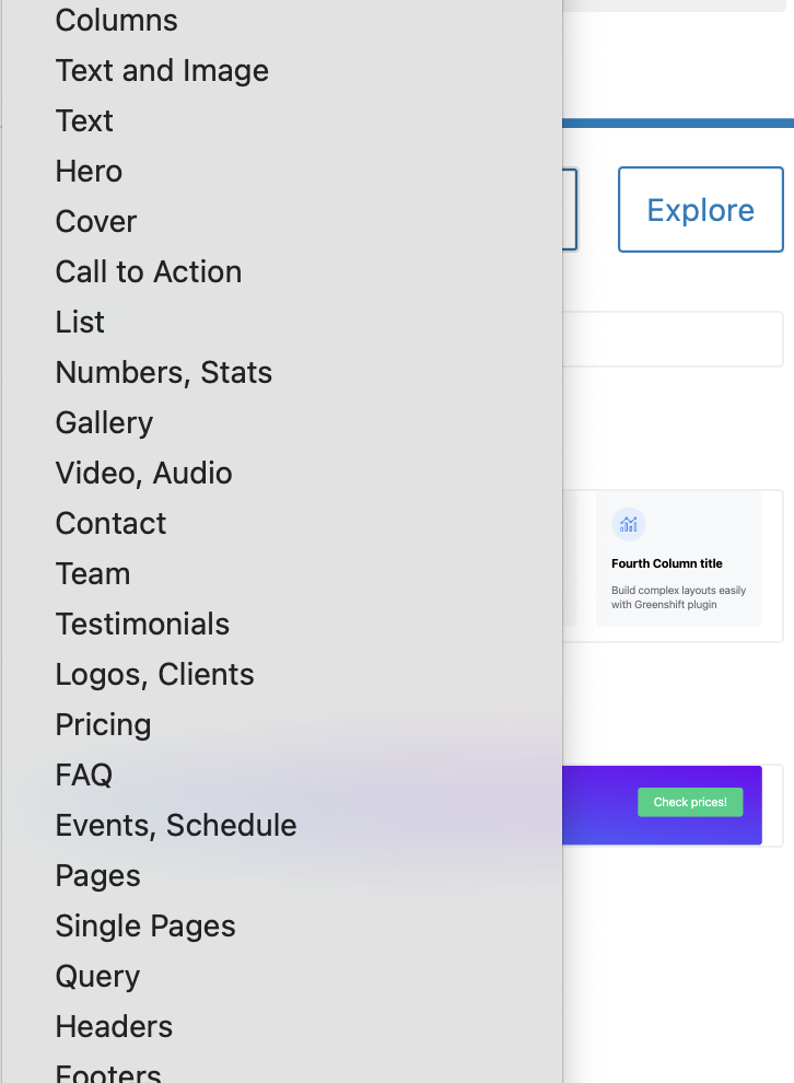
The most unwelcome trend in design today is beginning from scratch rather than using what’s already there. Fortunately, WordPress blocks encourage a level of smart integration. By default, core and third-party blocks all tap the standardized block insertion button (‘+’ at the top left of your editor screen) to bring more functionality into the editor.
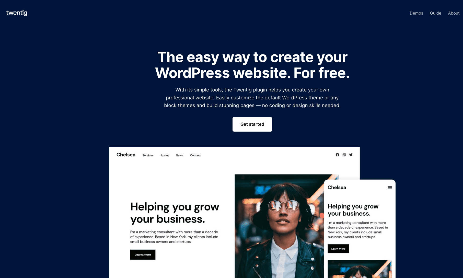
Sometimes, a plugin comes along that makes even the most efficient design process even more seamless. One of those plugins is Twentig, a plugin originally built to put a 500-horsepower engine into the 2020 theme. As the plugin evolved to enhance 2021 and now 2022, Twentig pivoted from a customizer companion to adding block patterns to adding enhancements to any template capable of full-site editing. The rapid change Twentig’s made in two short years deserves to be commended.
Twentig’s value lies in its simplicity: It just works. Rather than add a bunch of new blocks that clog up the block inserter, Twentig adds additional functionality to the *core* WordPress blocks. The utility of this free plugin is staggering.
Simple, Fast Creation Tools
I don’t get the sense that Twentig’s purpose is to provide granular customization tools like a Block library. While more options are certainly useful, Twentig’s strength lies in building smart layouts necessary for businesses and bloggers alike.

Patterns are plentiful and use WordPress core to lay out what a site page or template needs: covers, heroes, full single pages. Here’s an example of a CTA pattern, where I added padding, full-width, and a Twentig shape to the top border of the group block:
Subscribe to Blocks and Patterns
If you have any questions or just want to say hello, please don’t hesitate to contact us. We’ll get back to you soon.
Plugins like Twentig feel easier to use for pattern insertion than even the wonderful Block Pattern Directory, which still requires me to break my flow to find a new or saved pattern. Sure, I should be saving patterns in my own WordPress instance, but for users that are brand new to post-Gutenberg WordPress, it’s a faster experience from Point A to Point B.
The design limitations will certainly frustrate users who want more options. I can’t, for example, add a block shadow and a shape to the same block. Sure, the workaround is wrapping the block in a 2nd group block and add the shadow. That’s more steps than it should be.
But that critique misses what the product is designed to do: Build a simple page quickly using core blocks.
Site Templates
Twentig created site templates they refer to as “Starter Websites,” easily importable from the app. The sites are designed for simplicity and the color palettes are thoughtful. I can’t help but wonder if this plugin’s marketing strategy couldn’t work better for capturing a Squarespace or Wix audience versus the trend of vertical integration with hosting providers. Especially for an audience anchored to a “set it and forget it” experience for simple resume pages.

They have a host of other starter websites that are now able to be imported into WordPress, assuming you are using one of the default themes.
Twenty Twenty-One and Twentig: A Fantastic Pair
For those of us who can’t quit the customizer, there’s good news. Twentig adds much-needed design options to the Twenty Twenty-One default theme, including the ability to add a full-screen cover to the pages and posts. This works beautifully alongside the font selections Twentig adds to the customizer under “Twentig Options” and it undoubtedly adds to the shelf-life and longevity of the theme.
Full-Site Editing themes offer this on a per-page basis out of the box, but for WordPress users who want to see a familiar face, this is a welcome addition. It also adds:
- Header layouts & sizing
- Additional styling options for buttons
- Page settings & alignments
- Site settings and elements
- Starter site imports
These are useful features for those with little to no coding knowledge, and I can’t help but feel more impressed by the full-site editing roadmap when discussing Twentig’s options. WordPress 6.0’s site editing features are very much in beta, but I can already do all of this and more in Twenty Twenty-Two. The developers of this plugin did a nice job pivoting to block-level functionality and not overinvesting in template design for previous WordPress versions. Kudos to a smart roadmap.
Design Options Needed
Twentig’s current design options for core blocks are a good start, but there’s a lot more opportunity for WordPress blocks that can extend to future versions of the plugin. I’ve been using it alongside ABS which Justin Tadlock reviewed on WPTavern prior to his departure. I’d like to see this similar functionality worked into Twentig.
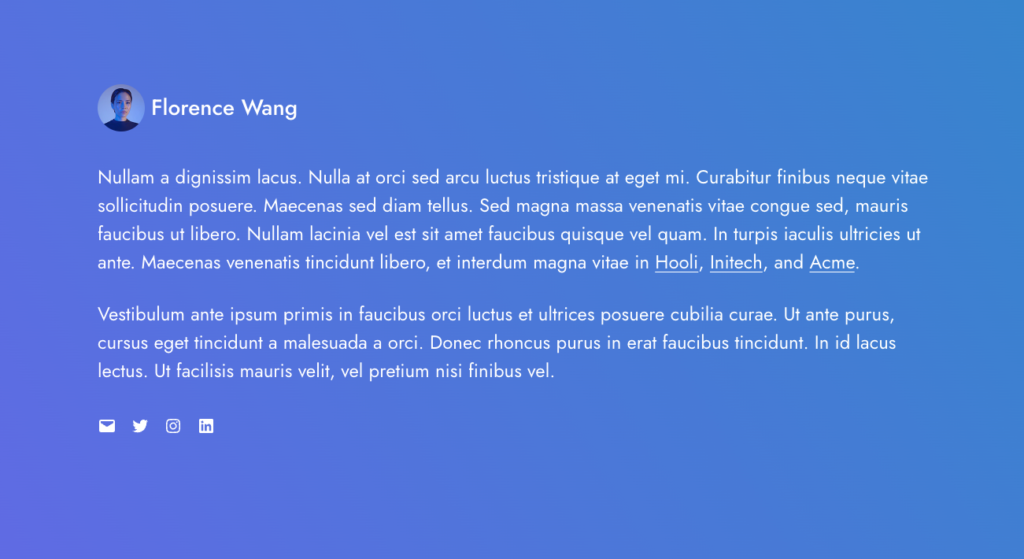
It would be a departure from keeping as close to WordPress Core as possible, but I appreciate the design flexibility that this offers:

Text overlay over an image gradient
Using both plugins is great, but I’m bullish on the user demand for developers to customize core blocks with new design options alongside plugins that create new ones.
Overall
Twentig’s enhancements of the Twenty Twenty-One default theme would have been enough on its own, but the built-in patterns, use of WordPress core blocks, and useful updates are so encouraging. There’s certainly room to push design as well as additional templates for block themes. Blocks and Patterns uses it regularly and considers it a must-have plugin.
It can be downloaded here.
WordPress Plugin: [Twentig]
