When WordPress announced the pattern directory, I was skeptical. Outside of the initial suggested patterns, adoption was sluggish at first. But many months later, the WordPress community’s been building some useful patterns and sharing them for approval in the pattern directory.
It’s early days in block development, but the power of the pattern is beginning to take hold for seasoned developers, themes, and newer users alike. Here are five contenders for the best patterns in the directory, along with the code. Remember, all of them are made in core patterns and don’t use third-party block libraries.
Single Page Post Page w/ HeroAuthor: FinestWebGeeks.com / [Copy Pattern]
Some newer block themes are experimental. They might be bare bones and/or are purposely not opinionated designs. This Single Page Post pattern doesn’t try to be more complicated than it needs to be while still including a hero image and image placements within the body copy. A natural extension for a simple single page on your blog.
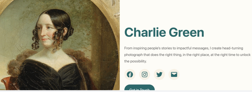
Author Bio with Image HeaderAuthor: BlockArt / [Copy Pattern]

Good for a minimalist landing page or for inclusion on a larger ‘About’ section, I love the simplicity and the color palette of this block pattern. The icon background color and short author description tie the entire pattern together design-wise.
Hero PageAuthor: Tony Salat / [Copy Pattern]

The cover block is one of the most important blocks in the Gutenberg toolkit, so it’s nice to see Tony Salat utilize it so well in the design. “Hero page” design over the past few years feels a bit too safe: large, full-width images with some overlay text (usually the H2) followed by text. I love that it builds CTAs into the cover pattern is a welcome twist on the vanilla flavor trap many similar patterns fall into.
The three subheaders with copy lines are versatile. They’d be candidates for CTAs or featured pages (as they’re used here). But I can also see site owners repurposing this as key takeaways or article summary cards.
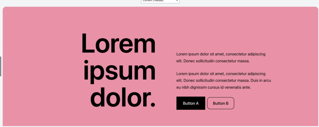
Hero Section with GradientAuthor: Anariel Design / [Copy Pattern]
Ana Segoto’s design agency’s doing some of the most exciting work on theming with block patterns in the community right now. It makes sense one of her block patterns is here, too. Arguably more than any other pattern in the directory, this shows the versatility of design and blocks in a Gutenberg world.

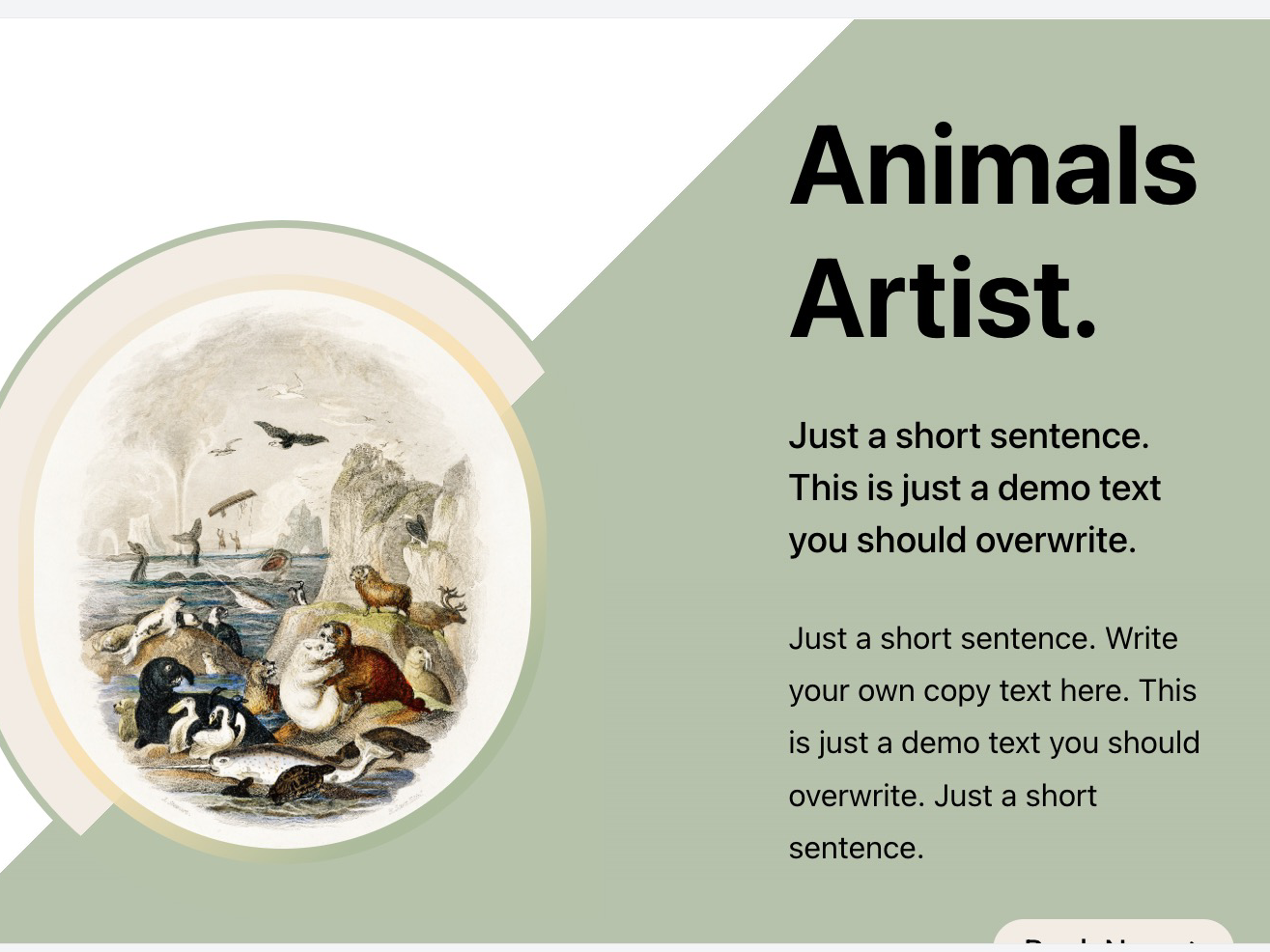
Featured Section with Round CornersAuthor: Vagelis / [Copy Pattern]

I’m an unforgiving critic of the block patterns built for business in the directory. Spend five minutes in there and you’ll see why. Many of them feel like the stock image version of a pattern.
That’s why this modern solution to an often overdesigned problem makes the cut.This feature section unlocks a more direct conversation with someone interested in your business, but is versatile enough to include as a single page header and/or page section.